
Creating accessible Word documents
Introduction
This document is intended to be a self-learning resource to help you create accessible documents. Using the information given here (together with the accompanying videos and web resources) you should be able to create digital documents that are easy to use for everyone, including persons with disabilities, and compliant to accessibility standards.
Acknowledgments
This document makes use of resources created by Microsoft to explain the Office Accessibility Checker tool. The source tutorials and videos are located on the Microsoft website.
Why think about accessibility?
Persons with disabilities may be facing difficulties in reading documents created by you. Many documents contain hidden obstacles that can sometimes deny or restrict access to users with disabilities particularly persons with blindness, low vision, colour blindness, reading disabilities and certain mobility impairments.
People with disabilities use digital documents in different ways. Some of them may want to listen to the document using text-to-speech software, or read it on an electronic braille display, while others may want to magnify the text and change the foreground and background colour to suit their visual disability. Some of your readers may be using the keyboard to navigate through your documents while others may be using touch, voice commands, a modified mouse, head stylus or even eye tracking technology.
You need to keep in mind that content created by you will be consumed by people in different ways. If you don’t consider this variety while creating the content, millions of people will find it hard or impossible to use your creations.
The World Health Organization estimates that about 15% of the world’s population lives with some form of disability, therefore a significant number of people are likely to be denied the right to information if the content is not in a format which they can adapt as per their own needs for reading. In addition to being the right thing to do, Digital accessibility is also a regulatory requirement as per many international and domestic conventions/laws.
Accessibility Standards
Catering to the needs of persons with diverse needs may seem very daunting to the creators of content. Thankfully you don’t have to think about the needs of each disability neither you have to test your products with all the assistive technologies.
There are globally accepted standards and best practices for creating accessible digital content. Some of the most adopted standards are: WCAG, Section 508, EPUB Accessibility and PDF/UA. Adherence to any one of these ensures that the documents will be usable by everyone including persons with disabilities without any significant barriers.
The accessibility guidelines and best practices for creation of digital documents are aimed at achieving the following objectives:
- Creating a structured and navigable document – It should be possible for all readers to easily identify and move to any position in the document such as a Chapter or sub-section. Tables, lists, notes etc. should have been created using the best practices instead of customized methods.
- Provision of text descriptions for graphical content such as pictures, flow charts and maps so that visually impaired readers do not miss out on important aspects of understanding the document.
- Providing an adaptable format that is marked-up semantically – It should be possible for readers to adapt the visual presentation of the document to suit their reading needs. Meaning of different text elements should be conveyed not only through visual presentation e.g. colour, alignment but also through use of appropriate built-in styles.
Microsoft has provided an accessibility checker within its Office applications. Ensuring that your documents pass the tests of this Accessibility Checker is generally sufficient to ensure that people with different disabilities will not have any major difficulty in using the content. In this document the Microsoft Office Accessibility Checker has been used as a benchmark. Note that accessibility for each and every user cannot be guaranteed, however, documents that pass the Accessibility Checker and the manual testing (described later) will certainly be more accessible and easy to use.
Accessible Word document creation workflow
It’s best to think about accessibility from the start of a project. It is desirable that the authors of the content are made aware of the accessibility requirements so that the designers or technical staffs involved in publishing does not have to spend additional time on retrofitting accessibility.
The accessible document creation process recommended in this document is summarized below.
Step 1: Prepare structured document with image descriptions in Microsoft Word.
Step 2: Use Accessibility Checker and fix errors if any
Step 3: Use at least one assistive technology such as NVDA (recommended) to test the reading experience and identify any remaining accessibility barriers
Step 4: Your accessible Word document is ready for sharing, or perhaps converting to other formats such as EPUB.
Step 1: Creating structured Word documents
Headers
Clear, well-formatted headings can go a long way toward making sure your word documents meet global accessibility standards. Many people use screen readers to create a list of headings so they can skim the document to find the content they want. But this type of navigation works only when the document’s author uses heading styles. Screen readers and text-to-speech tools are programmed to recognize them.
This step is explained in the video – Improve header accessibility
To add a heading style to text in Word, select the text, choose the HOME TAB in the ribbon, and in the styles box, pick the heading style you want.
When you save your document in another format for download, such as HTML or PDF, Word retains the heading styles so everyone can still get the benefits of your headings.
Always use heading styles in a logical order and do not skip levels. For example, Heading 1 will always be followed by Heading2 and Heading 2 will be followed by Heading 3 or another Heading 2. If this is not done, the document will not pass the Accessibility Checker tests. Further, screen reader users may think they have missed a heading or they may get confused by the order. And remember. When you are writing headings, keep them short, specific to the information that follows them, and clear to someone new to the topic.
Keeping the navigation pane open is very helpful while applying the heading styles. Click on the view tab and then select navigation pane to open the window which displays the list of all headings in the document.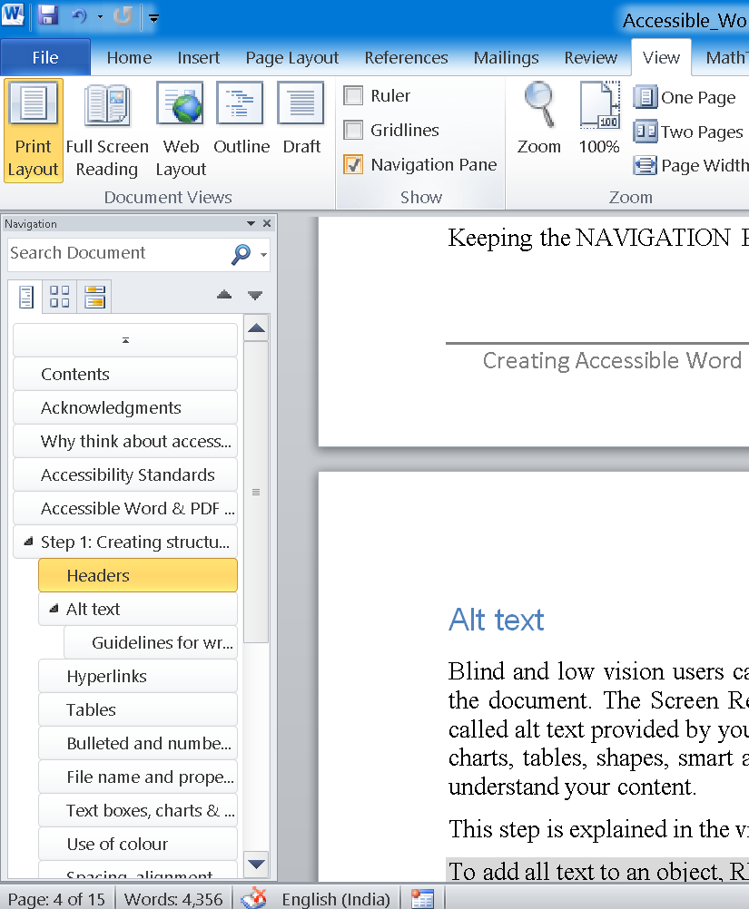
Alt text or image descriptions
Blind and low vision users cannot see and understand the non-textual content e.g. pictures, charts, maps in the document. The Screen Readers and the Braille devices can however read out the text description also called alt text provided by you in place of the graphical content. You should add alt text to pictures, clip art, charts, tables, shapes, smart art, graphics and embedded objects to help blind and low vision users to fully understand your content.
This step is explained in the video – Improve accessibility with alt text
To add all text to an object, right click on the object and choose format picture. Then click on alt text and in the description field type or paste the image description text and click Close.
Note that in different versions of Microsoft Word the Alt Text option may be placed differently.
To add all text to a table RIGHT CLICK the table, choose table properties. Then select the alt text tab. In the description box type a short description for the table and click OK.
Guidelines for writing alt text:
- Use Alt text to convey the important content or function of the object.
- Be concise, typically a few words are all you need those sometimes a short sentence or two might be appropriate
- Often the object is described in the surrounding text. In such cases your alt text should be very brief and should not be a repetition of the information already provided in the document.
- Since screen readers generally say what type of content the object is you don’t need phrases like “image of”, “table of” or “linked to”.
- Decorative images need not be described. Ensure that the alt text is empty.
A comprehensive set of Image Description Guidelines are available from the DIAGRAM Center.
If you think your audience needs more information you can write the description just below the object. For complex objects like charts people often write the description below the object. It is also common to prefix the description text with the words “Image description:”
Hyperlinks
If you have hyperlinks in the document, changing their display text to ordinary language can make them much easier to understand for users who rely on screen reading programs.
This step is explained in the video – Create accessible links
Right click the hyperlink on the page. Then choose Edit hyperlink. In the Text to display box, type a description and click OK.
When adding display text, avoid phrases like “Click here” or “Learn more”. Screen Reading software users rely on list of hyperlinks to browse the document. If the display text for all those links is the same generic phrase, such users will not be able to differentiate between the purpose of the hyperlinks.
Tables
Keep the following points in consideration while creating tables in Word documents.
- Use the default Microsoft Word functionality to create tables. Do not draw a table using lines.
- Try to make table as simple as possible. Screen readers and other assistive technologies do not cope well with complex tables. Avoid using merged cells, split cells and nested tables.
- Define the table and column width in percentages so that it adjusts to different screen and page sizes.
This step is explained in the video – Create accessible tables
Here are a few ways to check the accessibility of your tables. First, try navigating all the way through your table using only the tab key. If you can tab smoothly through the table, cell by cell and row by row, a screen reader should have no trouble with it. In English-language tables, the tab key should move from left to right, starting in the top left cell, and ending in the bottom right.
Next, consider the use of a designated header row for your table. Designated header rows make it easier for a screen reader to navigate your table, and some screen readers will call out the name of a row or a column before reading the data.
To designate a row as a header, select it, then right click and select table properties. Select the row tab. And check repeat as header row at the top of each page. Make sure allow row to break across pages is unchecked.
To provide alt text to table, in the table properties dialog, switch to the alt text tab and provide the text description.
A common stumbling block for accessible tables are split cells, where two cells occupy the space of a single cell. Select such cells, right click, and choose merge cells.
Bulleted and numbered lists
Use the bullets and numbering feature to create lists in the Word document. The list numbers or bullets should not be manually typed. When the lists are created using the automatic styles, assistive technology users are informed of the beginning and end of lists and also of the number of list items. This helps them in better understanding of the content.
To convert a list where the numbers e.g. a), b).. have been typed manually, select the entire content of the list, right click and then in numbering choose an appropriate style.
File name and properties
Giving your documents meaningful file names and document properties makes them easier to find for everyone. These steps are especially important for meeting new accessibility guidelines, like the US Section 508 Refresh, the EU directive on Accessibility, and many others around the world. A good file name provides clues to a documents content and age.
This step is explained in the video – Create accessible file names
To rename a document in file explorer, right click the file and choose rename. Type the new name and hit enter.
When the document is open in Word, you can add a title and author name to the document properties, which makes the file easier for others to find. Adding these properties is also part of the US 508 accessibility guidelines.
To modify properties of the document, click on file. The title, tags, author and other fields will be displayed on the right side of the window.
Use of colour
Text colour alone should not be used to convey information in a document. People with visual disabilities such as low vision and colour blindness are likely to miss out on this information.
Wherever possible use the heading styles. Alternatively, the coloured text can be underlined. If using colour in charts, supplement colour coding with texture, differences in line style, text in graphs, or shades of one colour to improve accessibility. Printing a colour document in black and white is the best test to see if you have lost any meaning.
Also take care of colour contrast, avoid putting very similar colours on top of one another. Good contrast between the text and background colour makes the document easier to read for everyone especially those with visual impairments.
Spacing, alignment and margins
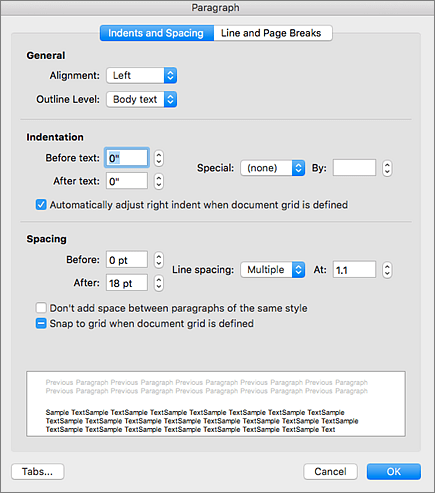
Very often people press the Enter key repeatedly to create desirable white space between paragraphs. The Tab key is also commonly used to position text or create an indentation effect. These blank lines and white space are annoying to screen readers while reading the document. Such formatting also creates issues in converting the document to other formats. Use the Word built-in features such as indentations, line spacing, and Styles to achieve the desired visual presentation.
To create extra space before or after a paragraph without pressing enter, right click and go to paragraph. Under spacing, adjust the before, after, and line spacing options.
Text boxes, charts & objects
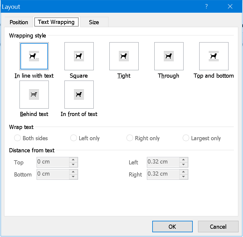
Screen reading software could ignore floating images, charts and other objects or read their alt text in wrong order. It is recommended to use the “in line with text” or the “top and bottom” option in text wrapping.
To change the text wrapping of images, right click on it and then click on size and position. Switch to the text wrapping tab and select in line with text.
Some other points
- Use simple language while creating the content
- Define the language of the content. This helps assistive technology like screen readers choose the correct voice for reading. To define language, select the text, click review, click language and then click set language
- Ensure that font size is sufficiently large across the document. The minimum size generally used is 11 points.
- Avoid using Watermarks. They can impact readability and create low contrast.
- In longer documents insert the auto generated table of contents for easier navigation
Step 2: Using Accessibility Checker
The Accessibility Checker tool finds accessibility issues in your Word documents. It is also available to test Excel spreadsheets, Outlook emails, and PowerPoint presentations. The tool generates a report of issues that could make your content difficult for people with disabilities to understand. Accessibility Checker also explains why you should fix these issues and how to fix them. In this document the Accessibility Checker in Microsoft Word has been explained.
The Accessibility Checker is demonstrated in this video- Check document accessibility
Start Accessibility Checker
If you are an Office 365 user, you will find it very easy to open and use the accessibility checker in Word. Look for the CHECK ACCESSIBILITY button on the REVIEW TAB on the Ribbon. Click it to open the Accessibility Checker.
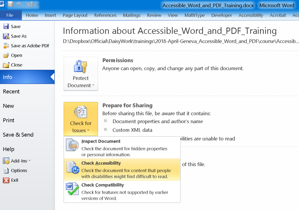
If you have an older version of Word such as Word 2010, and you do not see the Check Accessibility button on the Review tab on the Ribbon, follow these steps to open the accessibility checker.
- Click File \ Info.
- Select the Check for issues button.
- In the Check for Issues drop-down menu, select Check accessibility.
- The ACCESSIBILITY CHECKER TASK PANE appears next to your content and shows the inspection results.
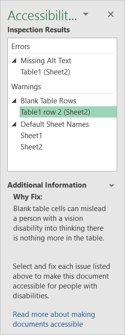
- To see information on why and how to fix an issue, under Inspection Results, select an issue. Results appear under Additional Information, and you are directed to the inaccessible content in your file.
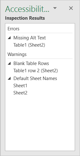
Understand the inspection results
After Accessibility Checker inspects your content, it reports the inspection results based on the severity of the issue found, categorized as follows:
- Errors. Issues that are reported as errors include content that is very difficult or impossible for people with disabilities to understand.
- Warnings. Warnings, in many cases, mean that the content is challenging for people with disabilities to understand.
- Tips. Tips let you know that, even though people with disabilities can understand the content, it could be better organized or presented to improve their experience.
Accessibility Checker errors, warnings, and tips
The following tables itemize the Accessibility Checker rules, what they check for, where to learn how to fix each issue, and why you should fix each one.
Errors
If content in the file makes it very difficult or impossible for someone with a disability to use, the Accessibility Checker classifies it as an error.
| Rule | Accessibility Checker verifies | Why fix this? |
|---|---|---|
| All non-text content has alternative text (alt text). | All objects have alt text and the text does not contain images or file extensions. | Screen readers speak the alternative text to describe images and other non-text content that users can’t see. Based on the alt text of non-text content, users should understand the purpose and meaning. |
| Tables specify column header information. | Tables and/or blocks of cells have the header box selected or a header row indicated. | Users rely on the table headings to understand the content that is subsequently read by the screen reader. Also, assistive technology often uses the table header row to help convey to the user the current cursor location in the table and to provide information that enables the user to navigate the table. |
| Documents use heading styles | Content is organized with headings and/or a Table of Contents (TOC). | Headings and TOCs provide structural context to users and enable navigation and easier searching in the document. |
Warnings
If the content in most (but not necessarily all) cases is difficult for people with disabilities to understand, the Accessibility Checker gives a warning.
| Rule | Accessibility Checker verifies | Why fix this? |
|---|---|---|
| Hyperlink text is meaningful. | Link text makes sense as standalone information, providing accurate information about the destination target. | Based on the text, users decide whether to click a hyperlink. The text should provide clear information about the link destination. |
| Table has a simple structure. | Tables are simple rectangles with no split cells, merged cells, or nesting. | Users navigate tables via keyboard shortcuts and assistive technology, which rely on simple table structures. |
| Tables don’t use blank cells for formatting. | There are no entirely blank rows or columns in the table. | Blank table cells can mislead a user into thinking that there is no more content in the table. |
| Avoid the use of repeated blank characters. | There are no runs of blank spaces, tabs, or carriage returns. | Spaces, tabs, and empty paragraphs often are read as blanks by assistive technology. After hearing several “blanks”, people might think that they have reached the end of the information. |
Tips
When there is content that people with disabilities can understand but that could be better organized or could be presented in a way that can improve their experience, you see a tip.
| Rule | Accessibility Checker verifies | Why fix this? |
|---|---|---|
| Layout tables are structured for easy navigation. | The layout order is logical for the language, and the tab order is not circular. | Users rely on the table layout to navigate through the content. It must be ordered logically for users to understand and navigate the content. |
| No image watermarks are used. | There are no watermarks. | Watermarks might be misunderstood as being part of the main content on the page and could cause confusion. |
| All headings are in the correct order. | All headings follow a logical order. | Sequential headings with appropriate levels help users navigate, search, and understand the document’s organization. |
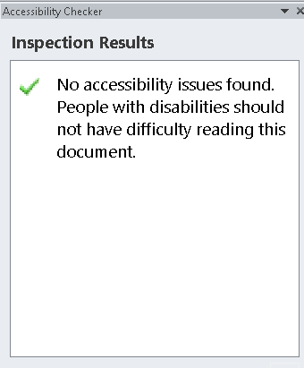
After fixing all the issues flagged by the Accessibility Checker, you will get a message “No accessibility issues found. People with disabilities should not have difficulty reading this document.”. Your aim should be to achieve this status before distributing any Word document.

Step 3: Using NVDA for manual accessibility testing
NVDA is a popular free and open source screen reading software for Windows. It can be used to check the reading experience that people with visual impairments will get. NVDA can also help identify issues that cannot be picked up by the Accessibility Checker such as appropriateness of the image alt text. The Accessibility Checker can only test whether or not the images have text descriptions. Whether or not the text description is appropriate for the image can be checked only with NVDA or a similar screen reading software.
Using NVDA keystrokes given below, you should check the document for reading order, navigability and image descriptions.
- Download and install NVDA from the NV-ACCESS website: nvaccess.org/download
- Start NVDA by clicking its icon on the desktop or by using the keystroke CTRL + ALT + N.
- Select “Use CAPS LOCK as the NVDA modifier key” in the welcome dialog. Henceforth, press CAPS LOCK in place of NVDA key mentioned below.
- Press NVDA KEY + CTRL + S to select a speech synthesizer. You might like the Microsoft SAPI voices.
- Now use the keystrokes listed below to check various aspects accessibility of the document.
| Feature | Keystroke | What to test |
|---|---|---|
| Headings/structure | Press NVDA key+spacebar to activate the browse mode. Then press H to move to next heading. Shift+H to move to previous heading. NVDA will read the heading and announce its “level”. Press NVDA key+F7 to open elements list and check the order and hierarchy of headings.| | The document should start with a Heading 1. All the major sections/chapters should be marked up at the same heading level. Heading level should not be skipped e.g. a Heading 3 after a Heading 1 is a violation of guidelines. A document should have sufficient number of headings. A long document with a very few headings is likely to fail Accessibility Checker tests. Heading text should not be too long. |
| Graphics | When in browse mode: press G to go to next graphic. Shift+G to previous graphic. NVDA will read alt text of the graphic if available | Listen to the NVDA voice while navigating between the graphics. Check if the description read out by NVDA is meaningful and appropriate. Often NVDA might read the file name of the image or its size etc. In such cases the Alt text should be checked by going into Image properties |
| Tables | When in browse mode: Press T for next table, shift+T for previous table. Use Ctrl + Alt + arrow keys to navigate between the cells such as Ctrl + Alt + Right Arrow for next cell. When browse mode is not active, ress tab key to navigate between the cells of a table. | Only tabular data should be represented as a table. While pressing TAB key check if NVDA focus moves through the table in logical order. In general the table should be read from left to right row by row. Split or merged cells may present in understanding the table. NVDA will read the column and row headings while navigating the table. Check if the header association is appropriate for the cells being read out. |
| Hyperlinks | When in browse mode: press K for next hyperlink. Shift+K for previous hyperlink. Press NVDA key+F7 to open elements and then check the list of links. | Listen to the NVDA and check if the link text is being read out properly. In general the URLs should be having meaningful display text |
| Reading order | NVDA key+down arrow to read continuously. Down arrow to read next line. Up arrow to read previous line | Check if NVDA is reading the document in logical order. This should be tested where columns, sidebars, text boxes are present in the document. Accessibility guidelines require the document to have a simple and logical reading order |
- Press CTRL key to interrupt speech (mute NVDA temporarily)
- Press NVDA key + Q to quit NVDA
If issues are discovered with NVDA testing, they should be fixed and the document should be verified with Accessibility Checker again.
Step 4: Save as accessible Word
Once the Accessibility Checker reports that the document has no issues and the manual testing with NVDA also does not flag any concerns, the Word document is ready for distribution.
To create an EPUB use the WordToEPUB tool from the DAISY Consortium. The created EPUB inherits the accessibility related mark-up done in the Word document, and there is the opportunity to add further enhancements as described in Getting started with WordToEPUB and Advanced guide to WordToEPUB.
To create a PDF use File / Save a copy (or Save as) then choose PDF. The created PDF file inherits the accessibility related mark-up done in the Word document.
It may be noted that PDF files can be further tested against the WCAG or Section 508 or PDF/UA specifications. This testing and fixing of accessibility errors requires additional knowledge and tools and is not within the scope of this document.
Further reading and support
More information on document accessibility is available at the Microsoft website www. aka.ms/accessible
A comprehensive set of Image Description Guidelines are available from the DIAGRAM Center. – diagramcenter.org
Subscribe to the DAISY Planet newsletter to get latest information on digital accessibility – http://eepurl.com/gef7Ez
Resources on creating accessible publications is available on the Inclusive Publishing website – inclusivepublishing.org
Tags: Word / WordToEPUB